RNA-Seq Analysis Part 2: Loading Data, Quality Control and Exploratory Data Analysis
RNA-seq
analysis
tutorial
R
Author
Robin Schäper
Published
March 18, 2026
Introduction
In this second part of our RNA-seq analysis series we will dive deeper into quality control, how to check basic assumptions about our data, detect potential outliers using principal component analysis and hierarchical clustering of Euclidean distances. We will also discuss how to correct for batch effects, which are technical variations that can arise from differences in sample processing, sequencing runs, or other factors that are not related to the biological conditions being studied. For this example we will use a count matrix from a type I diabetes study (bulk-RNAseq, whole blood) (Valentim et al. 2025). Depending on the available metadata, we can compare different tissues, individuals or treatment groups to each other, and the same methods can be applied to other types of omics data (e.g. proteomics, metabolomics, etc.).
Loading the count matrix and metadata
First we download the count matrix and load it into R, and then we load the metadata using the GEOquery package. The count matrix is a tab-delimited file with gene names as row names and sample names as column names, while the metadata contains information about the samples, such as treatment group.
#load necessary librarieslibrary(here) # for file paths# Downloading the count matrixurl <-"https://www.ncbi.nlm.nih.gov/geo/download/?acc=GSE123658&format=file&file=GSE123658%5Fread%5Fcounts%2Egene%5Flevel%2Etxt%2Egz"dest <-here("data", "rnaseq", "GSE123658_counts.tsv.gz")download.file(url, destfile = dest)# Loading the count matrixcounts <-read.delim(dest, row.names =1)dim(counts)
Let’s remove the “X” prefix from the column names of the count matrix, which is added by R when the column names start with a number (e.g. “1”, “2”, etc.). This will make it easier to match the column names with the sample names in the metadata.
Lastly, we will only keep genes with a count of 10 or more in at least 5 samples. The reason behind this is that low counts are dominated by sampling noise (fluctuate a lot just by chance) and we want to increase our power to detect true positives in statistical analysis (the more genes we test, the more we have to adjust our result for chance discoveries). The thresholds chosen do not follow a universal rule, but the higher the counts overall, the more strict we can cut for low counts and the more samples we have the more we can require expression in multiple samples. Depending on our experimental design, we might require expression of a gene in at least the smallest group size (e.g. if we will compare a specific group of 5 diseased samples in a certain age group with another group).
# require genes to have a count of 10 or more in at least 5 samples to be included in the analysiskeep <-rowSums(counts >=10) >=5counts <- counts[keep, ]
# Loading the metadatalibrary(GEOquery) # for loading data from GEOgse <-getGEO("GSE123658", GSEMatrix =TRUE)length(gse)
The authors of the study have sequenced samples using two different illumina platforms, this presents a great opportunity to discuss batch effects! Let’s finish loading the data and then we will check for batch effects in the next section.
Notice that the sample id and condition are embedded in the title column of the metadata, so we will need to extract them for downstream analysis.
meta$sample_id <-sub(".*ID:", "", meta$title)meta$sample_id <-trimws(meta$sample_id)# set row names of metadata to sample_idrownames(meta) <- meta$sample_id# define factor condition based on the title columnmeta$condition <-ifelse(grepl("healthy", meta$title, ignore.case =TRUE),"control","disease")meta$condition <-factor(meta$condition, levels =c("control", "disease"))table(meta$condition)
control disease
43 39
# define factor platform based on the platform_id columnmeta$platform <-ifelse(grepl("GPL18573", meta$platform_id),"NextSeq","HiSeq")meta$platform <-factor(meta$platform, levels =c("NextSeq", "HiSeq"))table(meta$platform)
NextSeq HiSeq
47 35
Now let’s align the count matrix and metadata to ensure that the samples are in the same order.
# Aligning the count matrix and metadatameta <- meta[match(colnames(counts), rownames(meta)), ]all(colnames(counts) ==rownames(meta))
[1] TRUE
One more thing: Right now our count matrix contains gene names as row names, but for downstream analysis with DESeq2 we will need to have Ensembl gene IDs as row names. We can use the biomaRt package to convert gene names to Ensembl gene IDs.
Now we create a mapping between Ensembl gene IDs and gene symbols using the biomaRt package, which will allow us to annotate our count matrix with gene symbols for easier interpretation of the results. We will add this as row data to our DESeqDataSet object later on. The reason we keep the Ensembl gene IDs as row names is that they are more stable and less ambiguous than gene symbols, which can sometimes be duplicated or change over time.
library(org.Hs.eg.db)library(AnnotationDbi) # for gene annotation# Create a mapping between Ensembl gene IDs and gene symbolsgenes <-rownames(counts)gene_symbols <-mapIds( org.Hs.eg.db,keys = genes,keytype ="ENSEMBL",column ="SYMBOL",multiVals ="first"# should multiple mappings occur)
Now we can create the so-called DESeqDataSet object, which is a container for the count matrix and metadata that is used for downstream analysis with the DESeq2 package. This object will allow us to perform various quality control checks and normalization steps before we proceed with differential expression analysis. We will use the “platform” and “condition” columns from the metadata as covariates in our design formula, which will allow us to account for potential batch effects and biological variation in our analysis.
library(DESeq2) # for RNA-seq analysisdds <-DESeqDataSetFromMatrix(countData = counts,colData = meta,design =~ platform + condition)rowData(dds)$symbol <- gene_symbols[rownames(dds)]# cleanup missing gene symbols (NA) and replace them with the Ensembl ID againsymbols <-rowData(dds)$symbol# Replace NA with Ensembl IDssymbols[is.na(symbols)] <-rownames(dds)# ensure uniquenesssymbols <-make.unique(symbols)rowData(dds)$symbol <- symbols
Let us now account for differences in library size within our data. To achieve this, we will estimate the size factors using DESeq2’s built in function estimateSizeFactors, which is an implementation of the median of ratios method.
dds <-estimateSizeFactors(dds)
Note🧠 The median of ratios method for count normalization
For each gene \(i\) and sample \(j\), we have the raw count \(k_{ij}\). The median of ratios method consists of the following steps:
For each sample, compute the ratio of each gene’s count to the geometric mean
\[r_{ij} = \frac{k_{ij}}{g_i}\]
The size factor for sample \(j\) is the median of ratios across all genes
\[s_j = \text{median}_i(r_{ij})\]
By taking the median of these ratios instead of the mean, this method is more robust to outliers and genes with very high counts. The size factors are then used to normalize the counts by dividing the raw counts by the corresponding size factor for each sample.
For visualization purposes, we will perform a variance stabilizing transformation (VST) on the count data, which will help to stabilize the variance across different levels of expression and make it easier to visualize the data.
vsd <-vst(dds, blind =TRUE)mat <-assay(vsd)
A closer look at count normalization and variance stabilizing transformation
I want to briefly show the effect of adjusting for library size in our data. Remember, library size adjustment is supposed to make samples more comparable to each other. Let’s look at the situation with raw counts.
Code
library(ggplot2)library(reshape2)library(plotly)counts <-counts(dds, normalized=FALSE)df_raw <-melt(counts)colnames(df_raw) <-c("gene", "sample", "expression")p <-ggplot(df_raw, aes(x =log2(expression), group = sample, text = sample)) +geom_density(alpha =0.15, color ="grey40") +theme_minimal() +theme(legend.position ="none") +labs(title ="Density plot of log2 raw counts")ggplotly(p , tooltip ="text")
Density plot of raw counts
Yikes, imagine we would start to compare any genes between samples at this stage - some samples clearly have systematically more counts in all genes than others. And this is a technical effect and not biology (although it makes me think: could a mutation in genes crucial for transcription lead to slightly higher or lower overall gene expression? Any strong alteration probably leads to an organism that is not viable).
What about the normalized counts?
Code
library(ggplot2)library(reshape2)library(plotly)# retrieve normalized countsnorm_counts <-counts(dds, normalized=TRUE)# convert to long form (one row for each sample and gene combination)df_norm <-melt(norm_counts)colnames(df_norm) <-c("gene", "sample", "expression")p <-ggplot(df_norm, aes(x =log2(expression), group = sample, text = sample)) +geom_density(alpha =0.15, color ="grey40") +theme_minimal() +theme(legend.position ="none") +labs(title ="Density plot of log2 normalized counts")ggplotly(p, tooltip ="text")
Density plot of normalized counts
Much better, samples are more comparable now. We notice that most genes have a moderate expression, on the left there is a second shoulder of genes expressed in the low-mid range and on the right there is a tail of highly expressed genes.
Three samples appear to behave different from the rest. They are very likely technical outliers, but since I do not have the original QC files available I won’t exclude the samples here. As long as one cannot clearly backtrace the technical error, the possibility of a biology reason remains in the room. I am not a fan of shaving everything unusual away and believe scientific discoveries are all about accepting these anomalies as something that could be non-technical.
Note🧠 Why do the curves look like this?
Low count genes fluctuate a lot from just sampling, variance is large relative to the mean (this behaves roughly like Poisson noise). Larger counts average out this sampling noise, but variance increases beyond Poisson levels due to biological variability (differences between individuals, cell state heterogeneity).
That is the reason why DESeq2 models counts with a negative binomial distribution, which has an extra parameter to account for this overdispersion once the mean expression gets big.
$$Var(X) = \mu + \alpha \mu^2$$
where $\mu$ is the mean and $\alpha$ is the dispersion parameter that accounts for the extra variability.
And why this distribution shape? A question of biology. Some genes are perhaps constantly expressed at moderate levels across all samples, while others are actively expressed due to environmental stimuli or disease state.
I would love to read more about this big picture view of gene expression - why are the logistics of a cell such and such and not different? I'll cut the ramble short here.
Now we add variance stabilizing transformation to lower the mean-variance dependency.
Code
# convert matrix to long formatdf <-melt(mat)colnames(df) <-c("gene", "sample", "expression")p <-ggplot(df, aes(x = expression, group = sample, text = sample)) +geom_density(alpha =0.15, color ="grey40") +theme_minimal() +theme(legend.position ="none") +labs(title ="Density plot of variance stabilized counts counts")ggplotly(p, tooltip ="text")
Density plot of variance stabilized counts
Great, having approximately homoskedastic data works best vor visualitations like PCA and clustering because it prevents a few highly expressed genes from dominating the variance in our data. Lowly expressed genes are also less noisy now.
PCA
Code
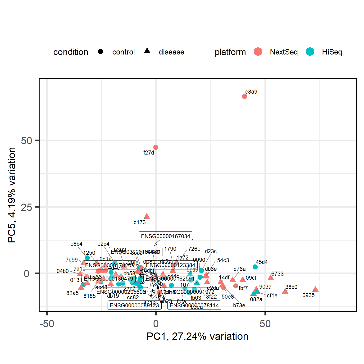
library(PCAtools) # for PCA visualizationp <-pca(mat, metadata = meta, removeVar =0.1)# set the row names of loadings to the gene symbolssymbols <-rowData(dds)$symbolmatched_symbols <- symbols[rownames(p$loadings)]# fallback for NAmatched_symbols[is.na(matched_symbols)] <-rownames(p$loadings)# ensure uniquenessrownames(p$loadings) <-make.unique(matched_symbols)biplot(p,colby ="platform",shape ="condition",lab =NULL,legendPosition ="top")
The separation of disease samples from control samples along the first principal component is quite subtle. Ideally, we would observe much more distinct clusters. What happened?
It could be that our condition of interest is confounded with a batch effect or other metadata variable, but we checked that.
It could be that the effect of our condition is simply small, but variance partitioning analysis showed us it is of a modest size.
It could be that disase samples are too heterogeneous in their expression profiles to cluster neatly.
It could be that cell composition varies substantially between samples. The dominant variation could be due to differences in cell abundance and not disease biology. Deconvolution methods, but ideally single-cell approaches could help.
It could be that we have to reconsider our statistical model, for example, we may need the interaction term ~ condition * sex to study the diease.
For now, we will proceed with the standard analysis, i.e. differential gene expression analysis and gene set enrichment. However, this gives us the opportunity to discuss our scientific question from a different angle. We may no longer ask: “what are consistently differentially expressed genes between healthy controls and type I diabetes subjects?” because such consistency is not what we find. Instead we may start to focus on why type I diabetes subjects are so heterogeneous. Are there perhaps defined subgroups? Let’s do a PCA with just the diseased subjects.
Code
library(PCAtools) # for PCA visualization# subset dds to diabetes samplesdds_diabetes <- dds[, colData(dds)$condition =="disease"]# get expression matrix of diabetes samplesmat_diabetes <-assay(vst(dds_diabetes, blind =TRUE))# get metadata of diabetes samplesmeta_diabetes <-as.data.frame(colData(dds_diabetes))p_diabetes <-pca(mat_diabetes, metadata = meta_diabetes, removeVar =0.1)# set the row names of loadings to the gene symbolssymbols <-rowData(dds_diabetes)$symbolmatched_symbols <- symbols[rownames(p_diabetes$loadings)]# fallback for NAmatched_symbols[is.na(matched_symbols)] <-rownames(p_diabetes$loadings)# ensure uniquenessrownames(p_diabetes$loadings) <-make.unique(matched_symbols)biplot(p_diabetes,colby ="platform",lab =NULL,legendPosition ="top")
It could be that we are dealing with three subgroups of type I diabetes gene expression profiles. Now we are at a crossroad where we can further investigate this new angle for our scientific question. However, for tutorial purposes, I want to show you how the standard analysis proceeds. Please be aware that at this crossroad we could also try to characterize the subclusters and how they differ in their gene expression profile in a similar manner.
Back to our full data with healthy and diabetes subjects. Let’s skim the data with a pairs plot to see if any other principal component is correlated with the platform, which would indicate a batch effect.
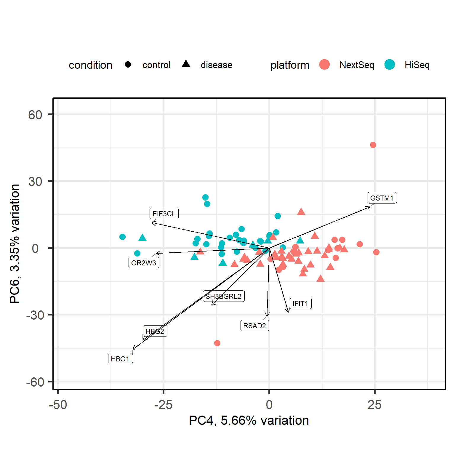
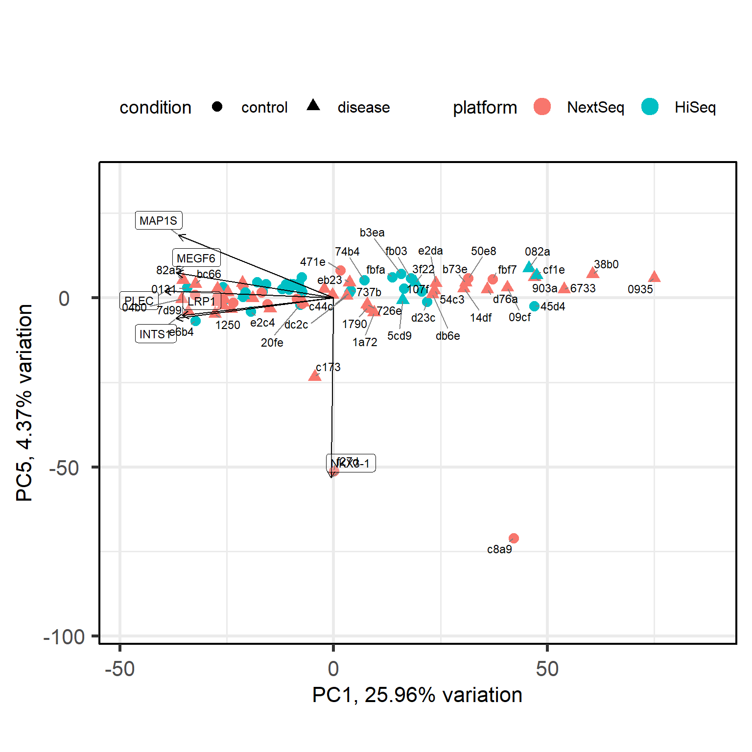
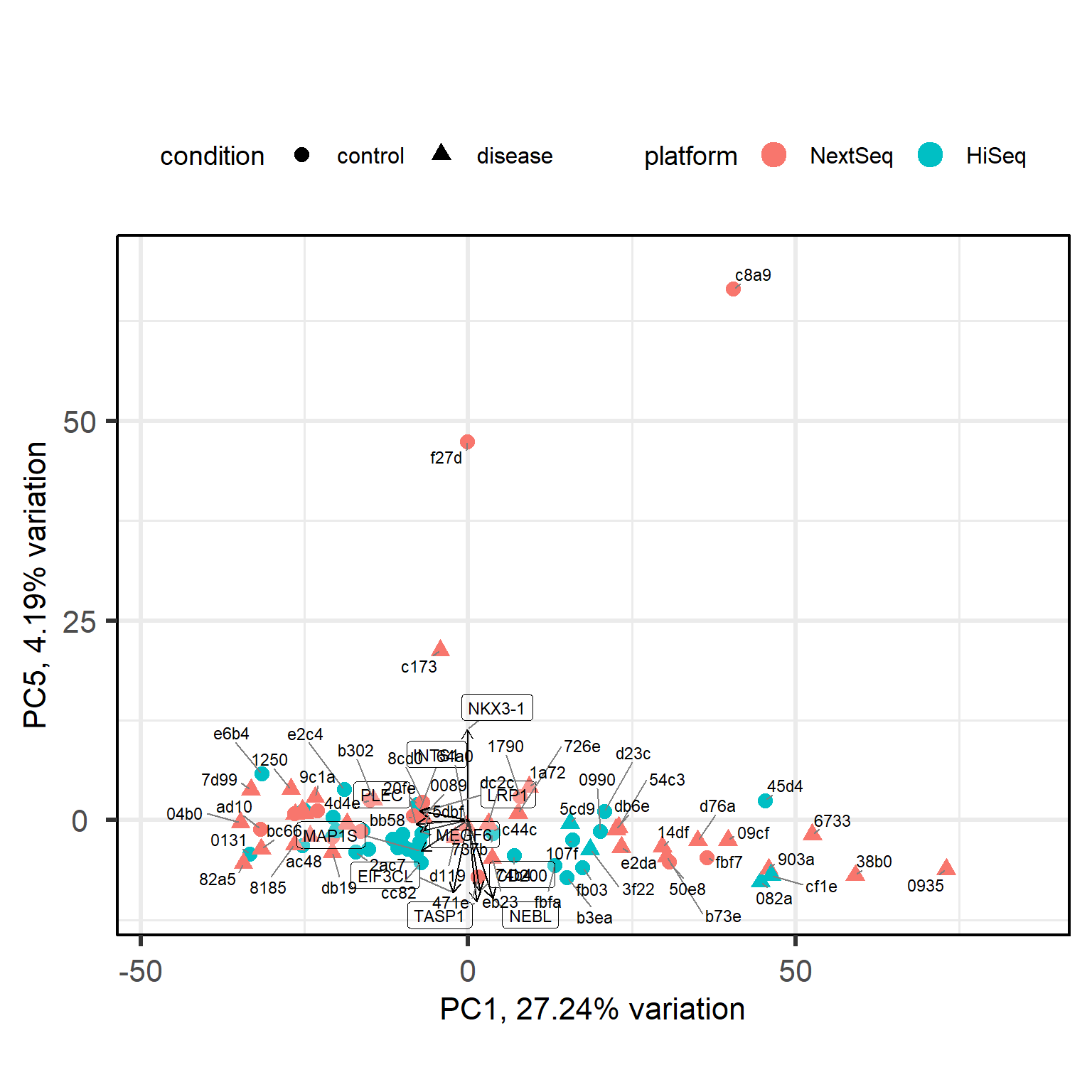
Principal components (PC) 4 and 6 seem to be correlated with the platform, which suggests that there may be a batch effect present in the data. We are also curious what PC5 is about.
To obtain accurate results in downstream analysis we could either remove the batch effect using a method like ComBat or limma’s removeBatchEffect or include the platform as a covariate in our design formula when performing differential expression analysis with DESeq2. In this case, we have already included the platform as a covariate in our design formula, which should help to account for any potential batch effects in our analysis.
NKX3-1 is a transcription factor that is known to be involved in prostate development and has been implicated in prostate cancer. It could be that this PC captures a biological extreme related to a prostate condition, or just a technical artifact. We will further investigate this with the Euclidean distance matrix and hierarchical clustering in the next section.
Hierarchical clustering of Euclidean distances
Euclidean distances are a common way to derive a measure of similarity between samples based on their gene expression profiles. The Euclidean distance between two samples is defined as:
\[d(x, y) = \sqrt{\sum_{i=1}^{n} (x_i - y_i)^2}\] where \(x\) and \(y\) are the gene expression profiles of the two samples, and \(n\) is the number of genes. The smaller the distance, the more similar the samples are in terms of their gene expression profiles.
Let’s calculate them in code and visualise the result as a heatmap.
Code
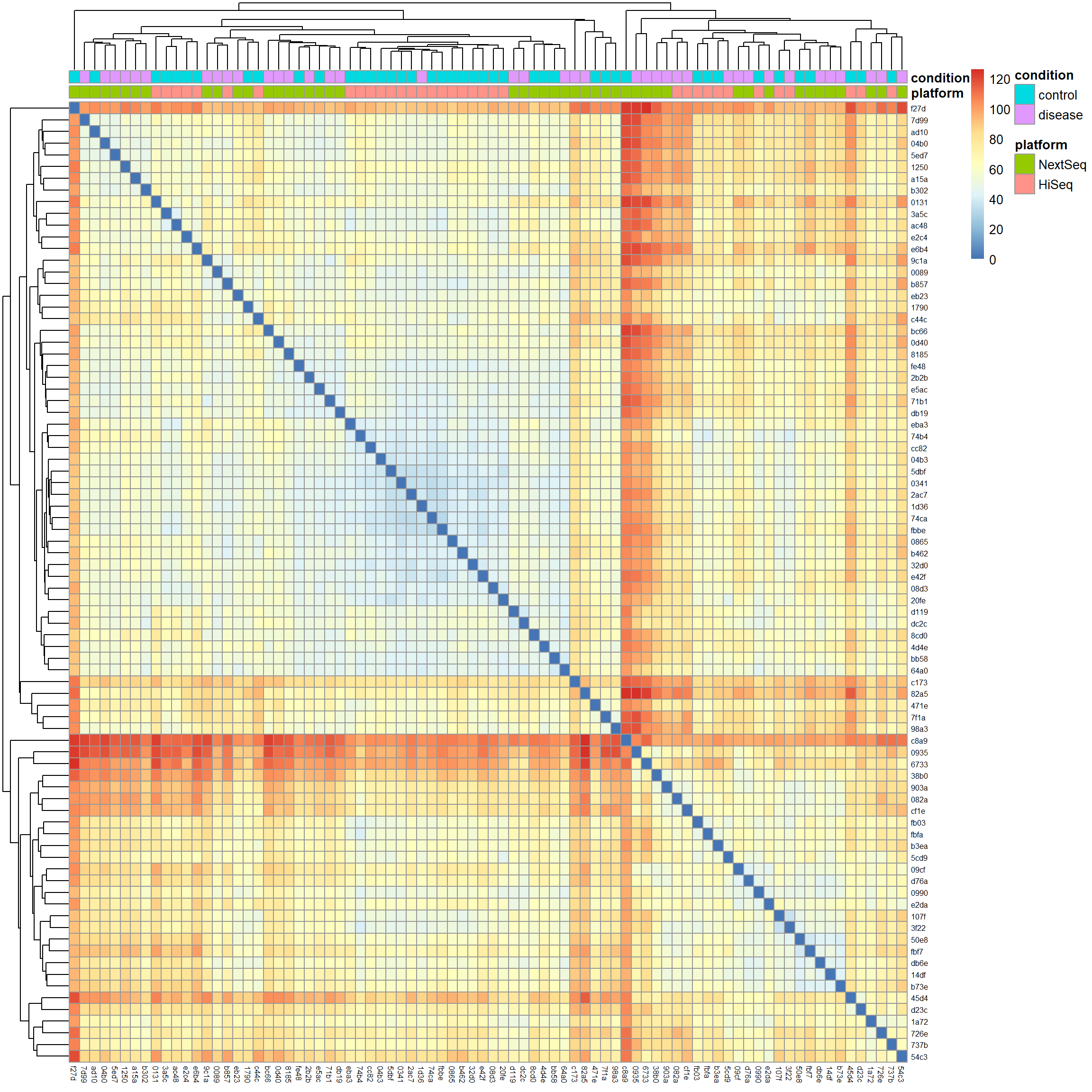
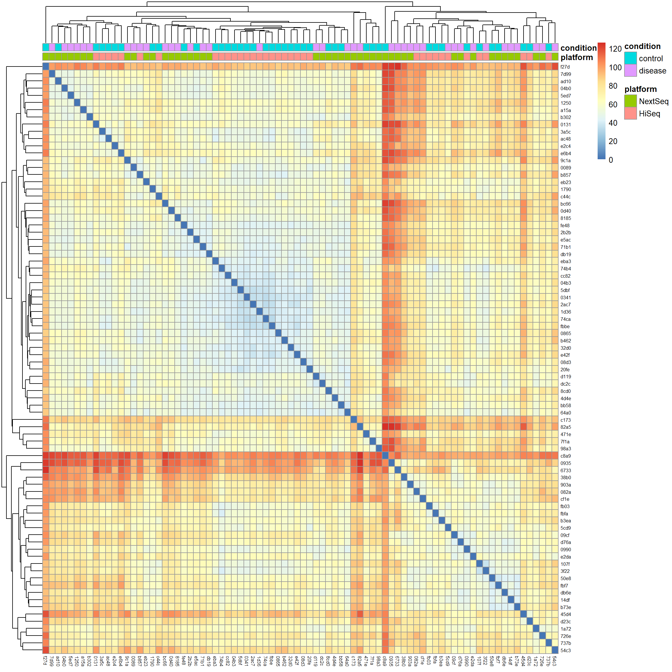
# Calculate Euclidean distancesdist_matrix <-dist(t(mat), method ="euclidean")# Hierarchical clusteringhc <-hclust(dist_matrix, method ="complete")# Visualize the distance matrix as a heatmaplibrary(pheatmap) # for heatmap visualizationpheatmap(as.matrix(dist_matrix),clustering_distance_rows = dist_matrix,clustering_distance_cols = dist_matrix,clustering_method ="complete",annotation_col = meta[, c("platform", "condition")],show_rownames =TRUE,show_colnames =TRUE,fontsize_row =6,fontsize_col =6)
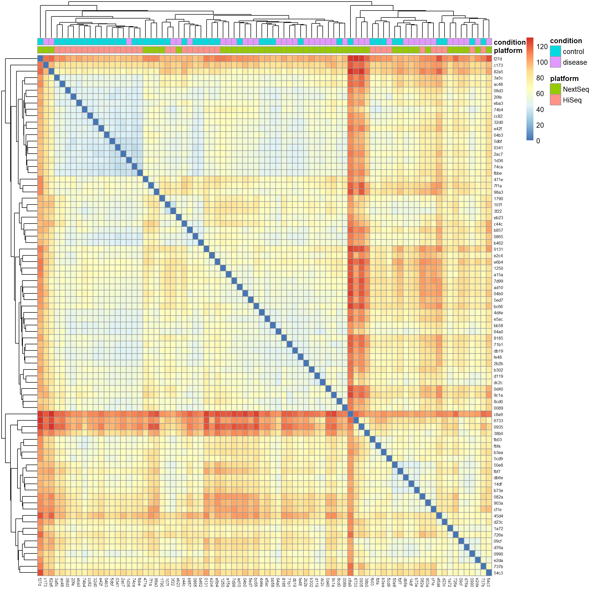
We notice two things: First, samples cluster by platform and the condition looks mixed within clusters. This further supports the idea that the batch effect is a strong source of variation in our data we definitely have to account for in downstream analysis. Second, there are red strips of samples which are highly distant from the rest of the samples near the top of the plot and around the middle (the red cross). We saw some of these outliers already in the gene expression density and PCA biplot. With no clear technical justification available, such as low sequencing depth, poor quality metrics, or evidence of contamination, we will keep them in the analysis.
Conclusion
In this part of the RNA-seq analysis series, we have loaded the count matrix and metadata, normalized our counts and performed a principal component analysis. We also calculated Euclidean distances between samples and visualized them as a heatmap with hierarchical clustering. We observed that there is a strong batch effect present in the data, which we will need to account for in downstream analysis. Additionally, we identified a subset of samples that are highly distant from the rest of the samples, which may indicate potential outliers or technical artifacts that we will need to investigate further. In the next part of the series, we will discuss how to perform exploratory data analysis and find out which variables are actually driving variance in our data with variance partitioning analysis.
References
Valentim, Felipe Leal, Océane Konza, Alexia Velasquez, Ahmed Saadawi, Nidhiben Patel, Roberta Lorenzon, Nicolas Tchitchek, Encarnita Mariotti-Ferrandiz, David Klatzmann, and Adrien Six. 2025. “Transcriptomic Module Fingerprint Reveals Heterogeneity of Whole Blood Transcriptome in Type 1 Diabetic Patients.” bioRxiv. https://doi.org/10.1101/2025.11.19.689306.